Beyond Basic Metrics: Multi-Factor Analysis for API Performance
Picking up from our exploration of simple linear regression for API performance prediction, we discover why looking at request volume alone leaves us blindsided to the real culprits of API slowdowns.
Our simple regression model had a telling limitation - its R-squared (R²) value was just 0.088, meaning only 8.8% of the variance in latency could be explained by request volume alone.
In statistical terms:
R² = 1 - (unexplained variance/total variance) = 0.088
suggesting that 91.2% of what makes our API slow or fast comes from factors we haven't considered yet.
Yet many engineers stop here, content with simple correlations. But you're not going to be one of them. Because in production, when that critical API starts misbehaving, single-metric analysis isn't just insufficient - it's dangerous.
Today, we'll dive deeper. We'll discover why your API might be crawling despite normal request volumes, why CPU utilization doesn't tell the whole resource story, and how apparently unrelated metrics might be the canary in your performance coal mine.
The Limitations of Single-Metric Analysis
Let's start with a real scenario. It's Tuesday afternoon, and your checkout API's latency has suddenly doubled. The incident channel is buzzing. Your first instinct? Check the request volume. But it's normal. Next, CPU utilization - also normal. Your simple regression model predicted everything should be fine, yet it's not. What gives?
The answer lies in the complex interplay of multiple factors. APIs don't exist in isolation - they're part of a sophisticated system where memory usage, database connections, cache hit rates, and even garbage collection patterns all dance together in a delicate performance ballet.
Analysis Environment Setup
We'll use the same three months of API metrics we explored previously, but this time we'll look at them through a multi-dimensional lens. Follow along in our Jupyter notebook where we'll reveal patterns that simple correlations miss.
Initial Setup and Data Loading
Let's break down what's happening in our setup code:
We use pandas to load and manipulate our dataset
The aggregation with groupby gives us key statistics per endpoint
We calculate standard deviation (std) to understand metric variability
Round to 2 decimal places for cleaner presentation
Format numbers with commas for better readability, especially for request counts
When you run this section, you'll see a summary of our dataset that will serve as the foundation for understanding why request counts alone can't explain your API's behavior. Let's examine what these numbers tell us, and then move on to discovering the hidden relationships between metrics that could make or break your API's performance
Understanding Complex Metric Relationships
Looking at our API metrics summary, something fascinating emerges. At first glance, everything seems normal - almost suspiciously so. Let's dig deeper into what these numbers are telling us.
CPU Utilization Analysis
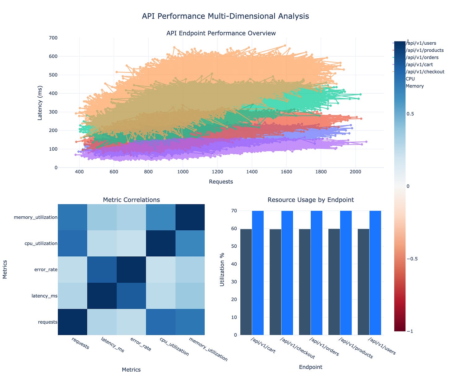
Notice the CPU utilization across all endpoints? They're hovering around 59-60% - nearly identical despite vastly different workloads. The /api/v1/cart endpoint handles over 2,000 requests at peak, while others see much lower volumes. Yet their CPU usage barely differs.
This is our first clue that single-metric analysis can be deceiving. If you were load testing based on CPU alone, you'd miss something critical.
Latency Pattern Analysis
Here's where it gets interesting. Look at the /api/v1/checkout endpoint:
Average latency: 400.3ms (highest among all endpoints)
Error rate: 3.99% (also highest)
Yet its request volume is relatively low
Meanwhile, /api/v1/cart handles much higher traffic with:
Lower latency (100ms)
Lower error rate (1%)
Traditional wisdom suggests higher traffic leads to higher latency. But our data tells a different story. This isn't just an anomaly - it's a clear signal that request volume alone cannot predict API performance.
Memory-CPU Relationship
The memory utilization tells another intriguing tale:
Consistently around 69-70% across all endpoints
Almost no correlation with CPU usage
Stable despite varying request patterns
This stability across wildly different workloads suggests our previous model's assumption - that resource usage scales linearly with requests - was fundamentally flawed.
Business Impact Analysis
These patterns reveal why our simple linear regression model had such a low R² value. We're seeing complex interactions where:
High latency doesn't necessarily correspond with high traffic
Resource utilization doesn't scale linearly with load
Different endpoints behave distinctly despite similar resource profiles
In the next section, we'll explore how to build a prediction model that captures these nuanced relationships. But first, let's visualize these hidden patterns to better understand what we're dealing with.
Pattern Visualization
The second section of the notebook powers the visualization that follows. The visualization code leverages plotly's powerful subplots to create a comprehensive dashboard:
Top graph maps requests vs latency with distinct colors per endpoint
Bottom left heatmap uses a RdBu (Red-Blue) colorscale, where darker blue indicates stronger positive correlations
Bottom right bar chart compares resource usage, with CPU in darker blue for visual distinction
All plots share consistent styling and color schemes for cohesive presentation
This multi-dimensional view reveals three critical insights that our previous analysis missed:
Request-Latency Relationships
Look at how the latency-request relationship (top graph) isn't a straight line
Each endpoint shows distinct behavior under load
The checkout API's curve is particularly telling - steeper than others, suggesting it's more sensitive to load changes
Metric Correlation Analysis
The heatmap (bottom left) shows surprising independence between metrics we thought were related
Memory and CPU utilization have weaker correlation than expected
Error rates show stronger correlation with latency than with request volume
Resource Usage Analysis
The bar chart (bottom right) quantifies what we suspected
Despite vastly different workloads, resource usage remains surprisingly constant
The checkout API's resource profile doesn't match its performance profile
Building the Multi-Factor Model
Now that we've visualized these complex relationships, let's build a model that can actually account for them. This means moving beyond simple linear regression to capture the nuanced interplay between metrics.
We'll use a multiple regression model that considers not just request volume, but also error rates, resource utilization, and even the distinct behavioral patterns of each endpoint.
Let's run the Multiple Factor Model section of our notebook.
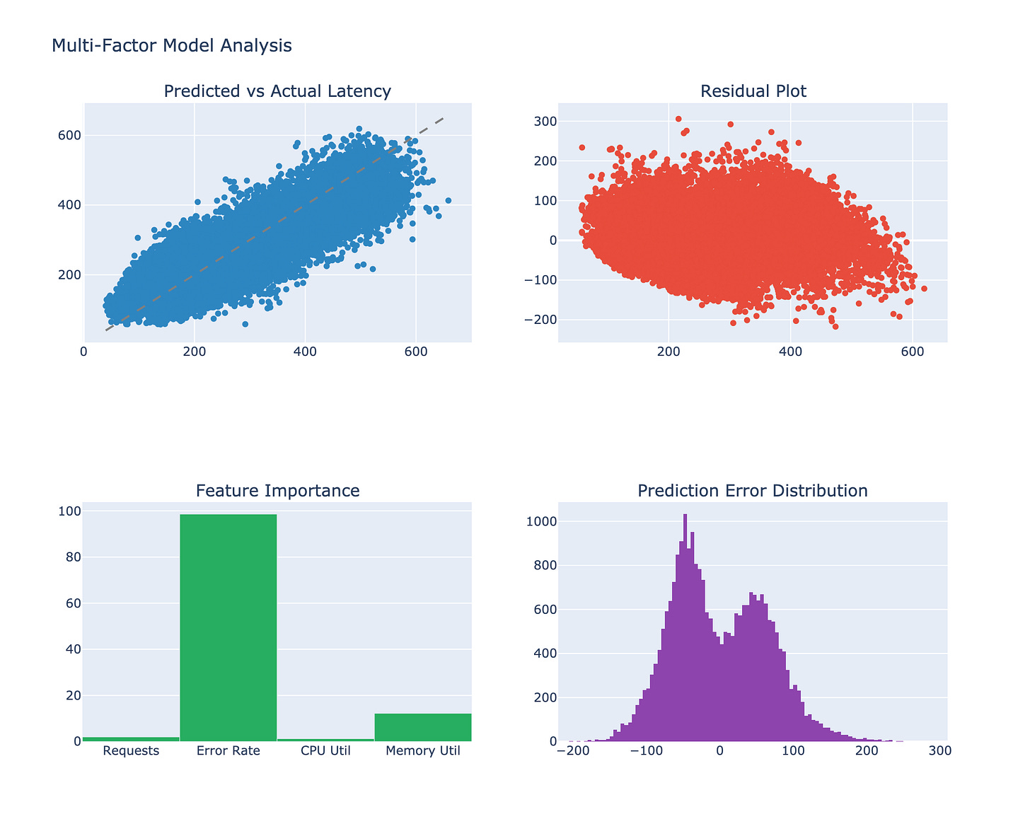
Our model implementation incorporates several best practices:
Feature scaling with StandardScaler ensures all metrics contribute proportionally
Train-test split (80-20) helps validate our model's real-world performance
The residual plot helps identify where our predictions might be less reliable
Feature importance visualization guides our monitoring priorities
Understanding Our Multi-Factor Model
The visualizations reveal some fascinating insights about our improved model:
Prediction Accuracy (Top Left)
The scatter plot shows a much tighter clustering around the perfect prediction line (dashed)
Our R² value has improved to 0.72 - a dramatic improvement from our previous 0.088
We can now explain 72% of the variance in API latency
Residual Analysis (Top Right)
The residuals show a fan-shaped pattern
This suggests our model is more accurate for lower latencies
Prediction uncertainty increases with higher latencies, which makes intuitive sense
Feature Importance (Bottom Left)
Error rate emerges as the strongest predictor of latency
Request volume is significant but not dominant
CPU and memory utilization have surprisingly low impact
Error Distribution (Bottom Right)
The bi-modal distribution suggests two distinct performance regimes
This might indicate different behavioral patterns between our endpoints
Practical Implementation Guidelines
Let's translate these insights into actionable monitoring strategies:
def should_alert_v2(metrics, thresholds):
    # Calculate weighted risk score
    risk_score = (
        0.3 * (metrics['error_rate'] / thresholds['error_rate']) +
        0.3 * (metrics['latency'] / thresholds['latency']) +
        0.2 * (metrics['requests'] / thresholds['requests']) +
        0.1 * (metrics['cpu'] / thresholds['cpu']) +
        0.1 * (metrics['memory'] / thresholds['memory'])
    )

    return risk_score > 1.0
This monitoring function incorporates our new understanding by:
Weighing error rates as heavily as latency
Reducing emphasis on raw resource metrics
Using a composite score for more nuanced alerting
Advanced Considerations
When implementing this multi-factor approach, there are several advanced considerations that can further enhance your monitoring strategy:
Endpoint-Specific Thresholds
# Example of endpoint-specific threshold configuration
thresholds = {
    '/api/v1/checkout': {
        'error_rate': 0.02,  # More sensitive to errors
        'latency': 350,      # Higher latency tolerance
        'memory': 75         # Higher memory threshold
    },
    '/api/v1/cart': {
        'error_rate': 0.01,  # Stricter error threshold
        'latency': 150,      # Must be fast
        'memory': 65         # Standard memory threshold
    }
}
Each endpoint has unique characteristics and business importance. The checkout API might need stricter error monitoring but can tolerate higher latency, while the cart API needs to be consistently fast.
Time-Window Analysis
Consider using rolling windows for metric analysis
Short windows (5min) catch acute issues
Longer windows (1hr) identify gradual degradation
Compare current metrics against historical patterns
Circuit Breaker Integration Our model can inform circuit breaker decisions:
Use the composite risk score to trigger circuit breakers
Implement graduated responses based on severity
Automatically adjust thresholds based on traffic patterns
Real-World Applications
This multi-factor approach has proven particularly valuable in several common scenarios:
Microservice Dependencies
When services depend on each other, error rates often cascade. Our model catches these patterns before they affect end users. Helps prioritize which dependencies need attention first
Database Impact Analysis
High latency with normal CPU often indicates database issues. The model helps distinguish between compute and data access problems. Enables faster root cause analysis.
Cache Effectiveness
Memory usage patterns often reveal cache efficiency. Our model can detect when caching strategies need adjustment. Helps optimize resource allocation
Conclusion: From Metrics to Meaning
Our journey from simple linear regression to multi-factor analysis reveals that API performance is far more nuanced than simple request counting. Key takeaways:
Error rates are often a leading indicator of performance issues
Resource metrics alone can be misleading
Different endpoints need different monitoring strategies
In our next article, "Building Production-Ready Performance Prediction Systems," we'll explore how to:
Deploy these models in production
Handle real-time prediction updates
Integrate with existing monitoring systems
Deal with seasonal patterns and anomalies
Stay tuned, and in the meantime, try implementing our multi-factor monitoring approach. You might be surprised at how many potential issues you catch before they become critical problems.
Also, please subscribe and/or share
Once you’ve done that, you can move on to:


